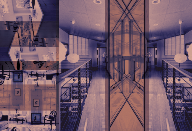
Building support for women in the areas of design and architecture.
Project
The goal of this project was to design
a typographic visual system and event
for a non-profit organization of choice.
The system also needed to function
and hold together visually across
multiple platforms. These platforms
included a printed book, responsive
website, mobile application, and interior
environmental branding.
Solution
The Organization for Women Archi-
tects and Design Professionals was
the chosen group and after research
and exploration, a visual system was
designed that would hold up and
function across multiple formats. The
visual goal was to represent women,
modern design and architecture in a
harmonious typographic system.
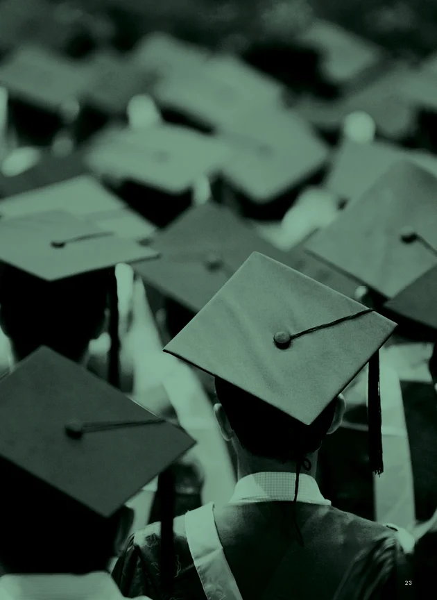
Helping students secure financial futures
and handle student debt.
Project
The purpose of this project was to chose a topic and design a non-profit organization to support that cause. An identity system, printed publication, responsive website, event and environmental design were all required to help display a strong visual system for the designed non-profit.
Solution
The chosen topic to focus on was financial aid and college students. The goal was to provide help to college students dealing with student debt and to provide information so students can make informed decisions. The non-profit was titled Student Aid.
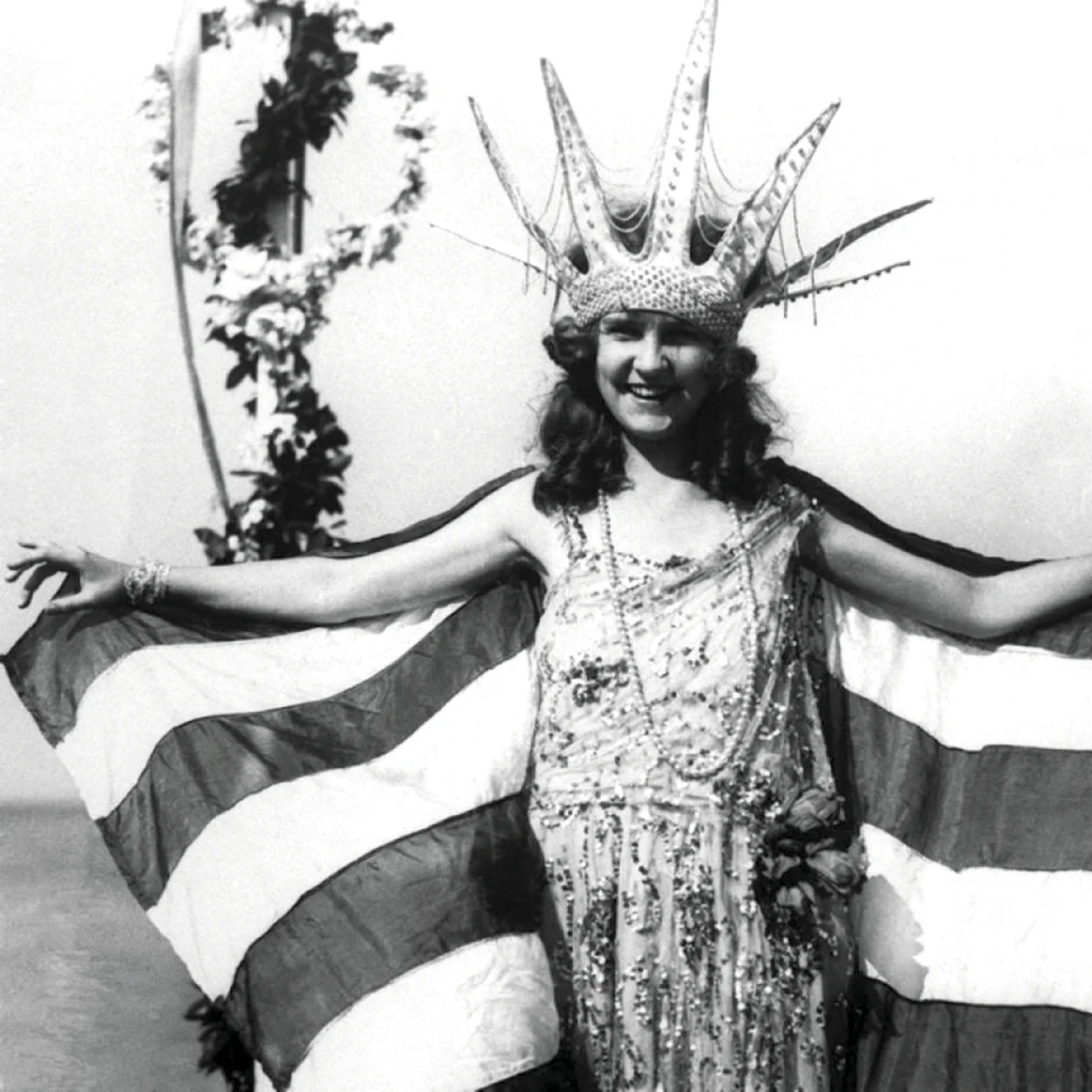
Reshaping the Miss America image and creating better role models for future generations to come.
Project
The goal of this project was to rebrand a chosen company as well as creating an extensive brand standards manual, identity, and visual system.
Solution
The chosen focus company was Miss America and the vision was to completely reshape the fundamental goals and overall image of the pageant company. The goal was to evolve Ms. America from the world of competitive, stereotypical, beauty pageant, “scholarship programs” to a strong group of aspiring women who crave leadership, knowledge and community—creating better role models for future generations to come.
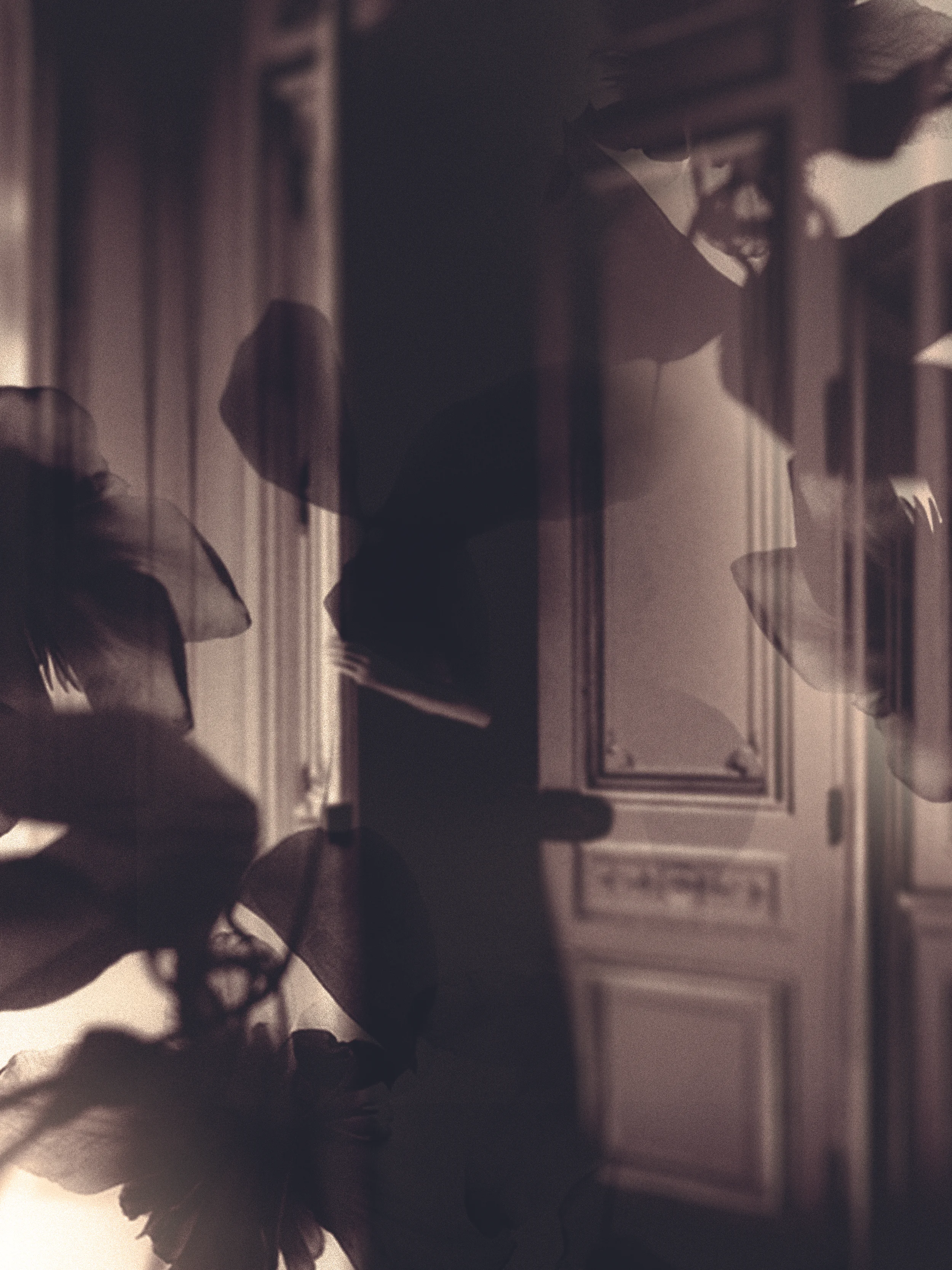
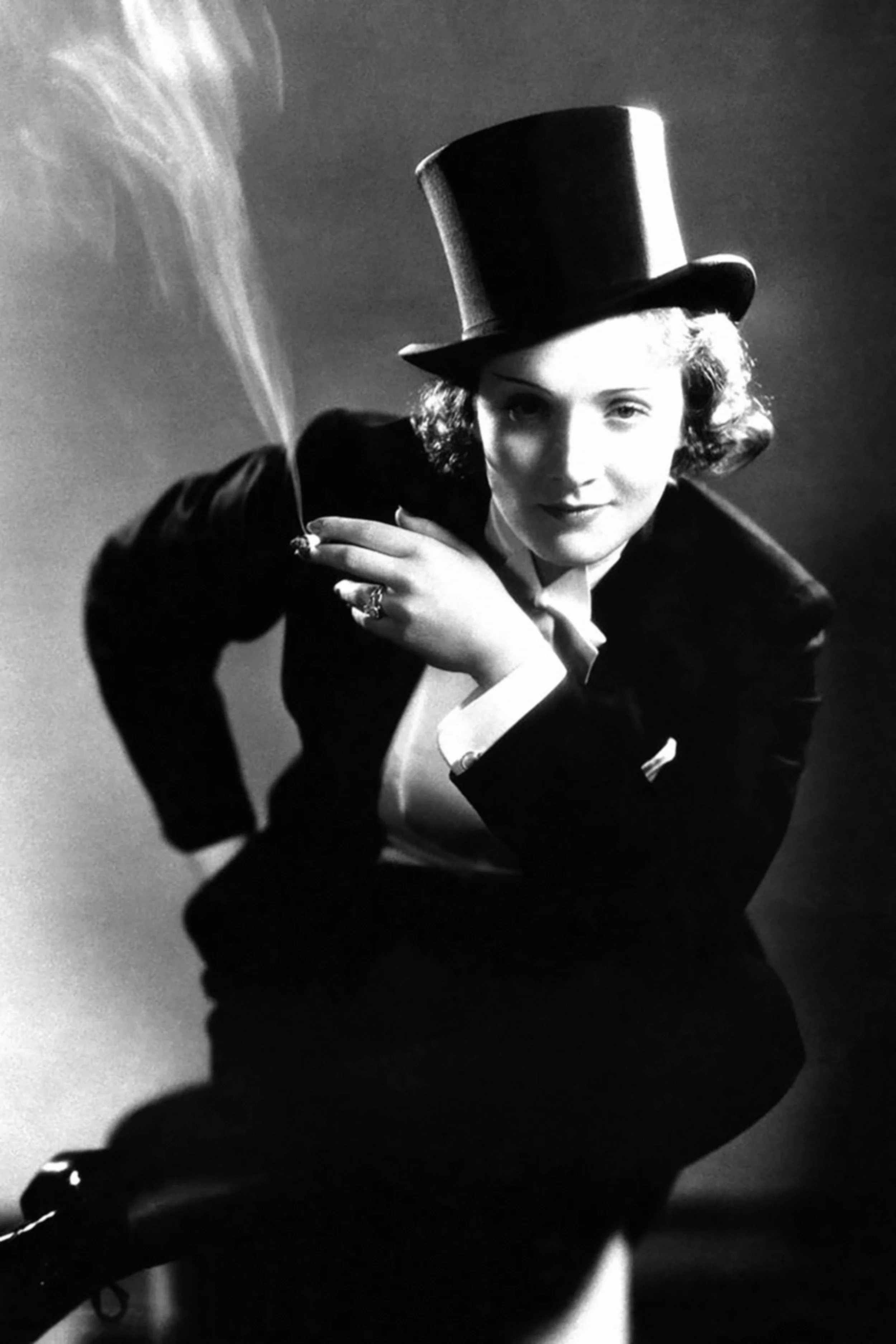
Breaking free through storytelling in the films of Baz Luhrmann.
Project
The goal for this project was to design a film festival for a chosen director. The design and visual system should display the essence and common thread linking the director’s films. An identity system, DVD packaging set, tickets and event design, as well as a website and catalog were required items for the project.
Solution
The chosen director for this project was Baz Luhrmann and his iconic films Strictly
Ballroom, Romeo & Juliet, Australia, Moulin Rouge, and The Great Gatsby. The title for the film festival is The Gilded Cage and it tried to pull together the glamorous storytelling of all of his films.
An experimental approach to the 2014 Vanity Fair Hollywood Edition.
Project
The goal of this project was to redesign a magazine of choice in a new way focusing on experimental typography and layout.
Solution
The magazine chosen was the 2014 Vanity Fair Hollywood Edition. The goal was to totally change the layout and format of the magazine making it large, changing its orientation and rethinking its standard grid.
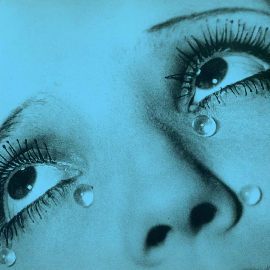
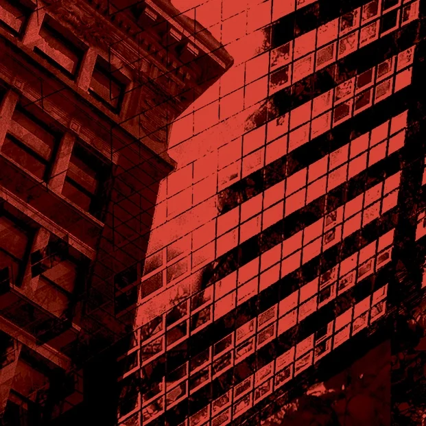
A visual exploration of a case and the sensation of vertigo.
Project
The goal of this project was to visually portray a concept relying solely on visuals and minimal typography. The book was to flow from spread to spread telling a visual story.
Solution
The chosen topic was the sensation and condition of vertigo. After exploring the city and capturing photos, a lot of time was spent manipulating the photos so that each page flowed together seamlessly with the goal of visually portraying the sensation of vertigo.
Providing support for locating the city’s many art museums and galleries.
Project
The goal of this project was to design an mobile application based on the city of San Francisco and utilizing the purposes of a mobile app.
Solution
The focus chosen was the art of San Francisco and its many museums and galleries. The goal was to provide an
app which could provide directions and updated current events for all of the
many museums and art galleries located throughout San Francisco.
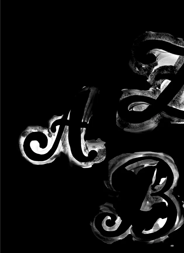
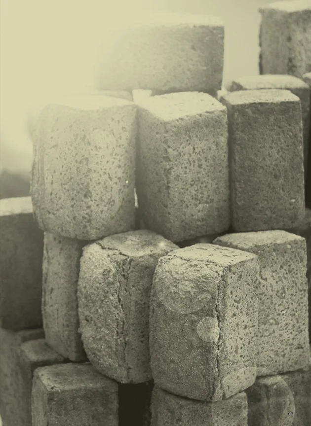
An experiment in typography and its shape and clarity as a single typeface.
Project
The goal of this project was to design a typeface in a experimental method and
form. Through visual exploration and hands on experimentation with different materials,
a typeface was to be derived that supported the idea and could hold together as a unique, singular typeface.
Solution
The solution after experimenting with many different materials, was a typeface made up by hand painted letters and then transformed through digital manipulation. The result was
a typeface whose forms were loose and unclear and the name given was Nebulous,
which means “in the form of a cloud or
haze; hazy.”
Rebranding the local family’s baking company of Anna’s Daughter’s Rye.
Project
The purpose of the project was to find
a company to rebrand based on a self
discovered hand-written sign.
Solution
While venturing through the farmer’s
market at the S.F. Embarcadero Ferry building, I discovered a sign for rye bread
and hot chocolate. The owner of the sign
was the family baking company Anna’s Daughter’s Rye Bread. After taking note of their current branding and packaging, a
rebranding was designed that improved
their overall style. The goal was to make it more contemporary, while also helping it stand out amongst its competitors and stay true to their core beliefs and family history.